Tara celebrates its 30th birthday: architects enthusiastic about the versatility of the Dornbracht classic
One line, one arch, one cross-handle. With these simple but concise attributes, Tara has become an icon. For three decades now, the Dornbracht classic, which was designed by Sieger Design, has been reinventing itself time and again to fit into a wide variety of bathroom architectures – sometimes classically, sometimes progressively. With its versatility, the fitting inspires architects worldwide.
WeWantMore appreciate Tara’s universal design
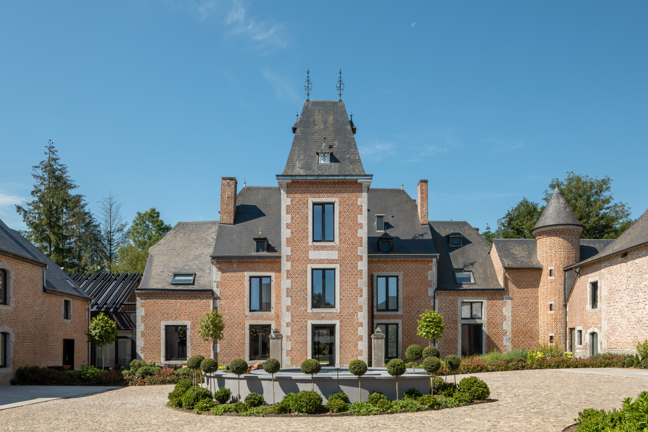
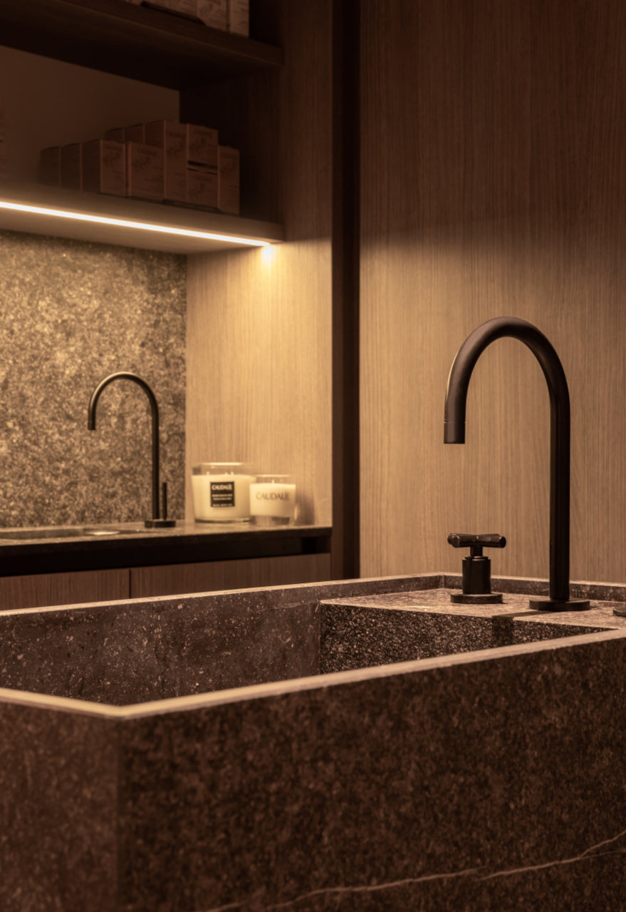
“We chose Tara because of the universal design that was also convincing in more unusual settings,” say WeWantMore from Antwerp. The team reinterpreted the rustic charm of the Château de Vignée, a former hunting lodge, in a special way. Tara plays an essential role in the bathrooms. There, the Matte Black surfaces of the bathroom fitting skilfully contrast with the marble tiles – whether with expressive or restrained grain.
Modernity of the fitting convinces Sjölund Åkerblom Arkitekter
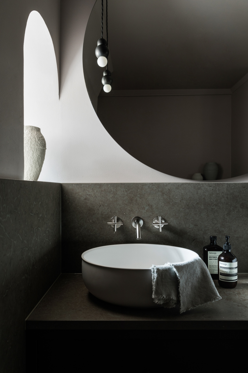
Sjölund Åkerblom Arkitekter also took advantage of Tara’s ability to blend into traditional surroundings. The architectural firm from Stockholm used the fitting in a historic building from the 18th century. The combination of old and new, of dark colours and light wooden floors, of coziness and reduced simplicity distinguishes this multifaceted project. Tara fits ideally into the ensemble: “It seems modern yet familiar,” says founder Petra Sjölund. “This means that we could make a point, without clashing with the history of the building,” she continues.
Studio Ben Allen use Tara for its versatility
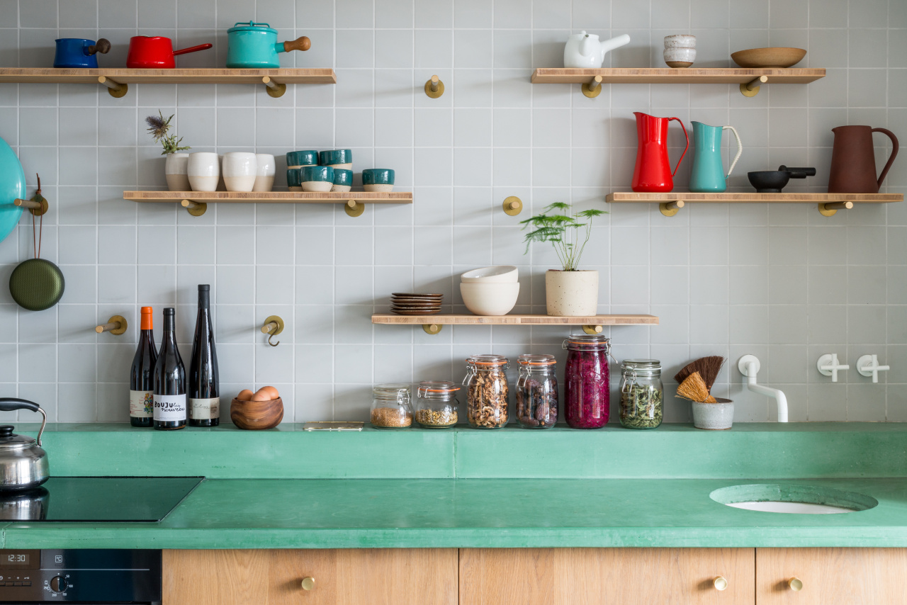
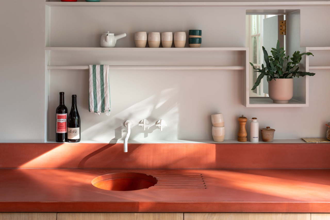
In a completely different context, Tara was used in the House Recast and the Cabinet of Curiosities. Studio Ben Allen from London opted for a Matte White kitchen fitting for both projects. The clear shapes of Tara and the purism of the surface calm the lively surroundings, which in both cases are characterised by a colourful kitchen countertop and fitting utensils. “We love Tara as a modern classic. The iconic cross-handles and semi-circular spout are unmistakeable. It can be staged in almost every conceivable way,” says founder Ben Allen.
Tara in the home of architect Frederic Kielemoes
Much simpler, but just as eye-catching, Tara fits into the home of Belgian architect Frederic Kielemoes. “The Tara collection fits in very well with the spontaneous and intuitive thinking behind our design concept. The fitting itself has a certain spontaneity that also seems entirely consistent. It is the perfect match for our home,” he says. Natural materials, such as stone, solid oak and concrete, convey a feeling of warmth and security there – just like Tara does.
This familiarity that the fitting embodies is due not least to its 30-year existence. Tara’s characteristic cross-handles and its soft design language have a clear recognition value, appear known. And yet the icon unfolds a different effect in every room – one reason why the Dornbracht classic continues to convince and surprise architects, designers and consumers alike.


